“A new chapter in the history of aviation in Latin America and the world begins”
By merging two of the most influential companies in Latin America, LAN, and TAM it was necessary to create a new makeover identifying the best of both worlds.
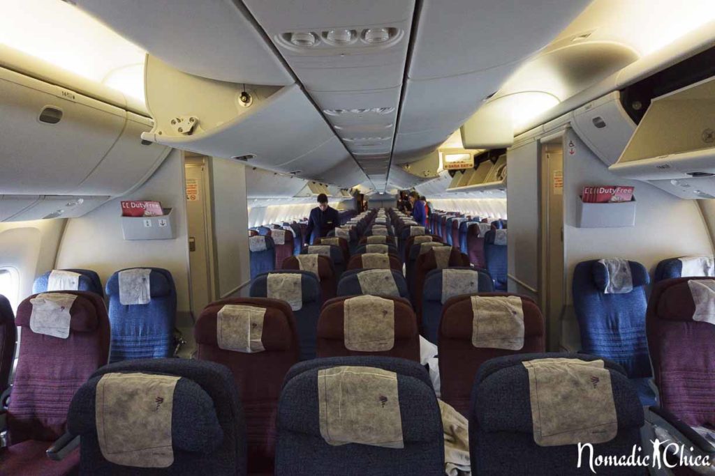
It has been a progressive change, designed to be completed within three years, as many changes must be implemented to make the whole transition complete. Since the unification have been implemented image changes as in counters design, onboard service, uniforms, which will deliver an improved service experience.
The image evolution towards LATAM began to be seen from May 5, beginning with the launch of the new platform and website, now www.latam.com.
Check out more about LATAM here
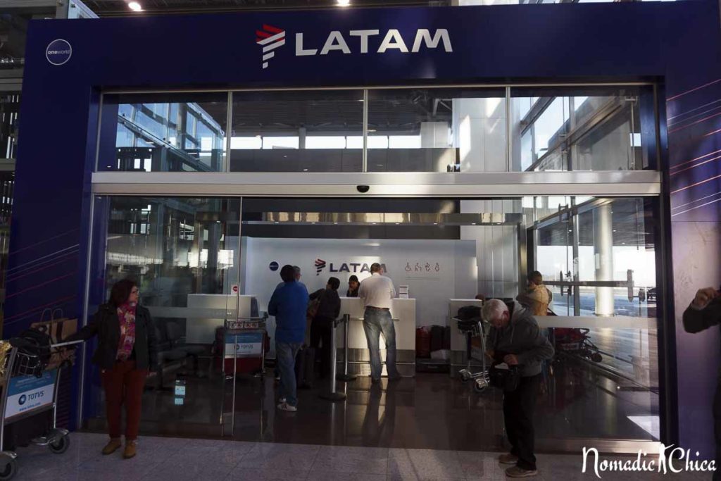
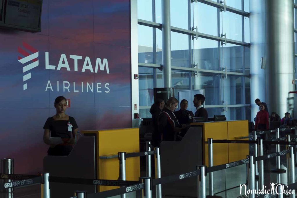
The first image changes began that day, in 13 airports where the airline operates. (Santiago, São Paulo, Rio De Janeiro, Brasilia, Buenos Aires, Lima, Bogota, Quito, Miami, Madrid, Guayaquil and New York). This change includes the new signage in Check- in counters, information screens, boarding passes, and VIP lounges.
They have presented the new uniforms that will be used by 23 thousand employees at the end of 2016.
The new strategy aims to position LATAM Airline as one of the three major airline groups in the world and to consolidate the new brand.
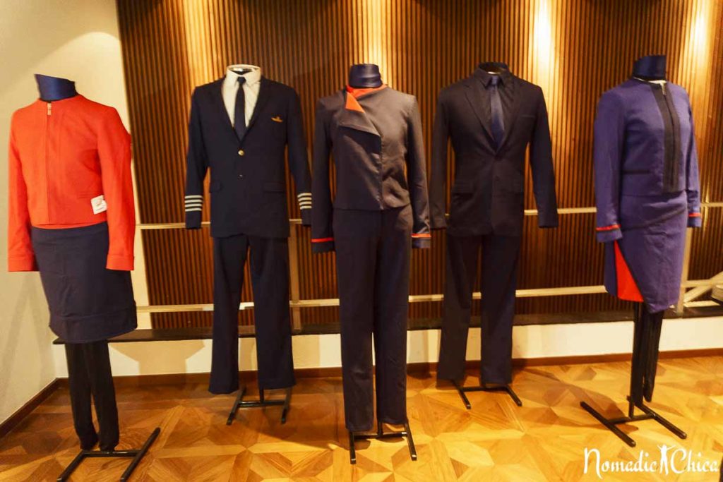
How the new LATAM Airline image was born
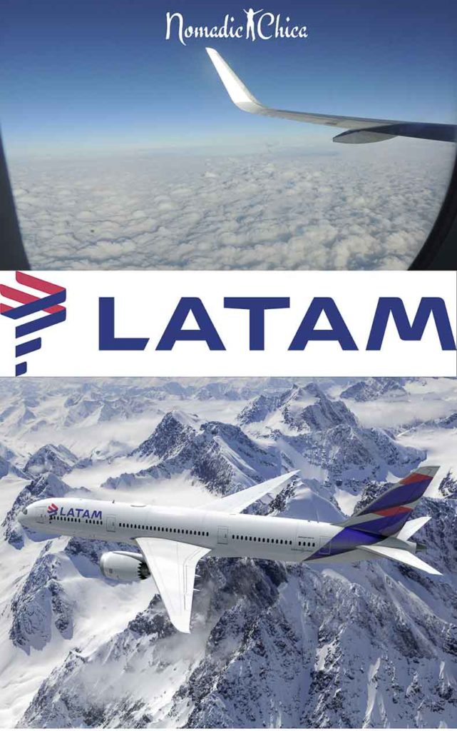
The LATAM new brand image was in charge of the agency Interbrand Brazil, which had the difficult task of representing the union of two powerful brands such as LAN and TAM. The designed logo symbolizes a map that is intended to represent the region.
The new brand also represents a new travel experience for users, simpler and better.
The brand design, which involved the Brazilian world renowned Pedro Lourenço, was recognized by the IF Design World by creating brand new LATAM, which gave LATAM and Interbrand the award for the category “New Brand Identity”.
The new symbol was designed in cooperation with workbenches where more than 80 people participated in the process of which were chosen the colors for the new image. Indigo and coral are a legacy of blue and red from LAN and TAM.
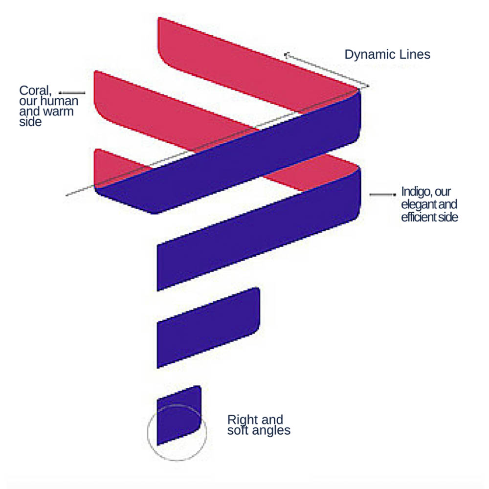
Both colors complement to refer to identity, heritage and diversity of the continent and symbolize values that are essential to the brand as being attentive, assertive, passionate and elegant. Indigo symbolizes efficiency and elegance, while the coral reflects the passion and the Latin American energy.
It is an elegant and efficient symbol on the outside with its shades of indigo and white, and at the same time warm and attentive inside through the coral color.
The name chosen for the company represents the legacy of LAN and TAM, considering that LATAM is the first Latin American brand since its origin, the name also reflects the commitment of the company to be a benchmark of the region’s industry.
From LATAM to the World, to the world to LATAM
LATAM’s new brand results after an extensive study in more than 10 countries and represents a milestone in the aviation industry as it is the first airline group to merger into a new unified brand.
The changes began in June 2012 and have gradually included operational and image changes as optimizing the aircraft use, a new website, new uniforms for 23,000 employees, new counters design, boarding passes and a new and modern in-flight entertainment system.
What users will experience it will be an easier access to the largest network of destinations within Latin America to the world through a renewed travel experience.



0 Comments